DIVISIBLE REDESIGN
2023, Self-Initiated
» UX/UI
» Strategy
↳
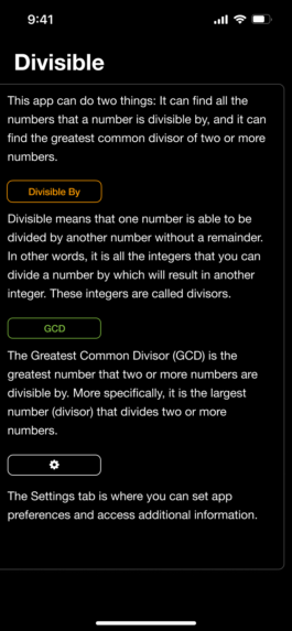
WHAT IS DIVISIBLE?
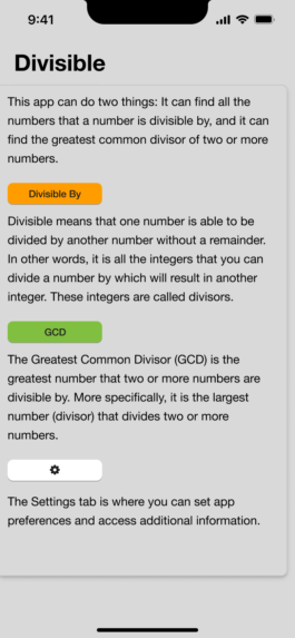
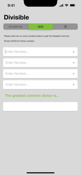
Divisible is the app version of www.Divisible.info, a website that hosts a variety of free division-based math tools.
The app offers two of Divisible’s most popular web tools in a convenient mobile format that doesn’t require an internet connection to run.
WHY DOES IT NEED A REDESIGN?
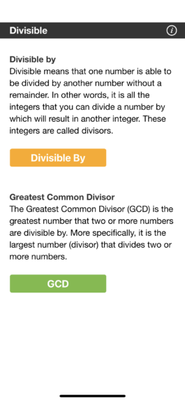
To put it plainly, the app is not pleasant to use. Buttons used to navigate on some pages are used to calculate on others. Switching between tools requires you to navigate through one of two expository pages - resulting in an explanation of how to use the app to be endlessly reiterated.
However, the most convincing case for a redesign is how the app's design hinders the ability to introduce new features. It is hard to imagine adding in a new tool without further exacerbating the issues that already exist.
screenshot of the divisible website, mobile app icon and screens.
↳
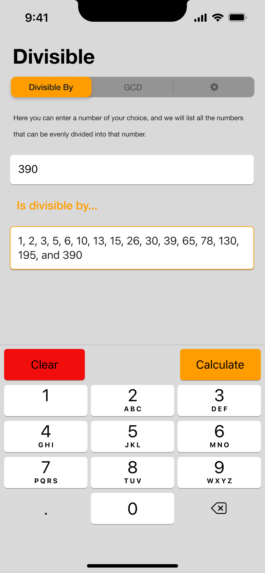
The core problem the Divisible app faces has to do with navigation and how the content is organized.
Looking at the four screens to the right, you'll see assets reused for both navigation and as a way to trigger calculations on each respective "tool" pages.

Nav Buttons


Both Nav and Function buttons
Original Navigation
Following the flow from the "Home screen" (the start of each user flow), you can see that each of the main tools are sequestered from each other — forcing the user to pass through either the "Info Page" or the "Home screen" in order to navigate to the other tool.
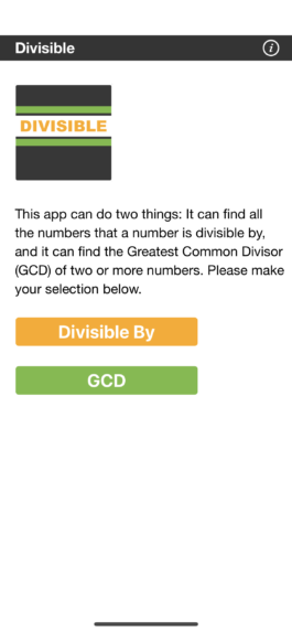
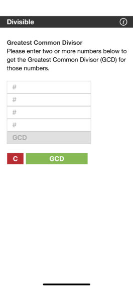
Home
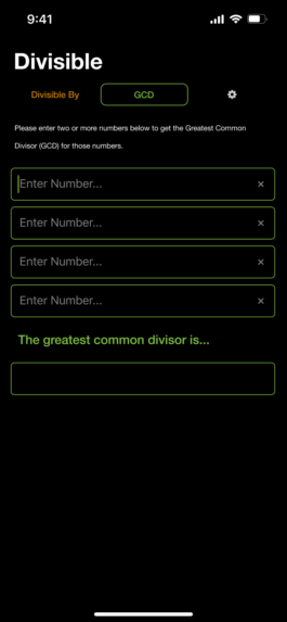
Divisible By
GCD
Info Page
↳
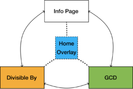
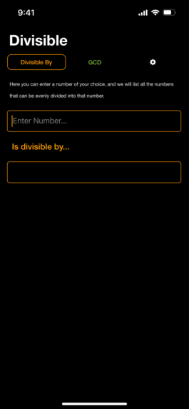
NAVIGATION:
The two main improvements made to the app was the streamlining of navigation buttons into a single menu bar, and the use of an overlay to consolidate written content into a page that is detached from the tools in which they describe.

Open Overlay Button


Navigation Buttons
Redesign Navigation
Comparing the "Redesign" flow chart to the "Original" flow chart, you can see how the use of an overlay screen and a menu bar allows a user to access any screen from any location on the app.
Home Overlay
Divisible By
GCD
Info Page
↳
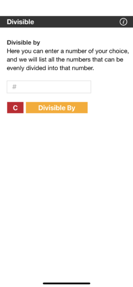
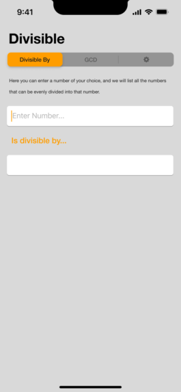
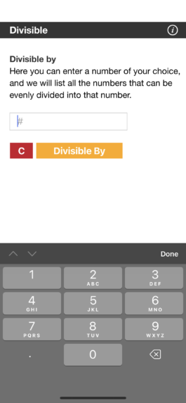
FUNCTIONALITY:
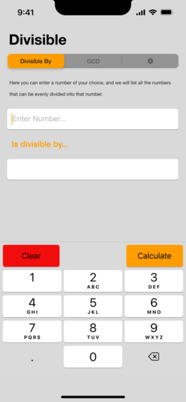
Another simple, yet significant, change was redesigning how the calculation buttons work.
In the original design you can see how the "Divisible By" button, which is used for navigation in other contexts, is used to perform calculations.
By integrating the 'calculate' and 'clear' buttons into the pop-up keyboard, the user experience is improved through the elimination of the number of steps needed to perform a calculation.
Original Design
Redesign
↳
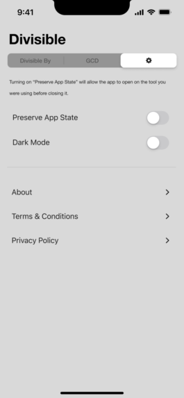
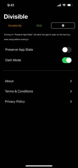
ADDITIONAL FEATURES:
Along with a dedicated "Settings" page, the options of "Dark Mode", and "Preserve App State" were added to the redesign.
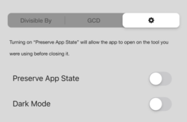
New features in settings
"Preserve App State" improves the experience of the app by opening the last screen the user used when they relaunch the app. This bypasses the "Home Page" that served as the start of every user flow in the original design.
Redesign in Dark Mode
screenshot of the divisible website, mobile app icon and screens.
Nav Buttons
Both Nav and Function buttons
Home
Divisible By
GCD
Info Page
Original Navigation
Following the flow from the "Home screen" (the start of each user flow), you can see that each of the main tools are sequestered from each other — forcing the user to pass through either the "Info Page" or the "Home screen" in order to navigate to the other tool.
Open Overlay Button
Navigation Buttons
Home Overlay
Divisible By
GCD
Info Page
Redesign Navigation
Comparing the "Redesign" flow chart to the "Original" flow chart, you can see how the use of an overlay screen and a menu bar allows a user to access any screen from any location on the app.
Original Design
Redesign
Redesign in Dark Mode
"Preserve App State" improves the experience of the app by opening the last screen the user used when they relaunch the app. This bypasses the "Home Page" that served as the start of every user flow in the original design.